We get to select a new flag for New Zealand via two referenda: one later this year to select the best alternative; then a run-off referendum next year between this best alternative, and the current flag.
The government panel has come up with a list of 40 to consider out of the tens of thousands of designs submitted by the public. This will be whittled down to four by mid-September apparently, but how they do this is something of a mystery.
Yes, there are lots of criticisms of the process that could be made. But I’ve never liked our current flag and maybe this is a once in a generation chance to fix it. And now that the opposition parties, who up until now were supporters of a flag change, have lined up against it maybe we won’t get another crack at this for a very long time.
I guess the dispiriting thing for me is that I dislike almost all of the 40 shortlisted designs. Too many ferns (dead white trees); too many stars (boringly common aspirational marker for flags); too many koru (swirly whirly things).
Some designs provide an easily consumable and reusable brand-NZ logo (which is what our single-mindedly corporate Prime Minister prefers, it seems); while others mix some or all of these elements into a feel-good salad of signifiers.
There are a small handful on the shortlist that are composed of simple, strong geometric shapes that tell a story and these are the ones that appeal to me the most.
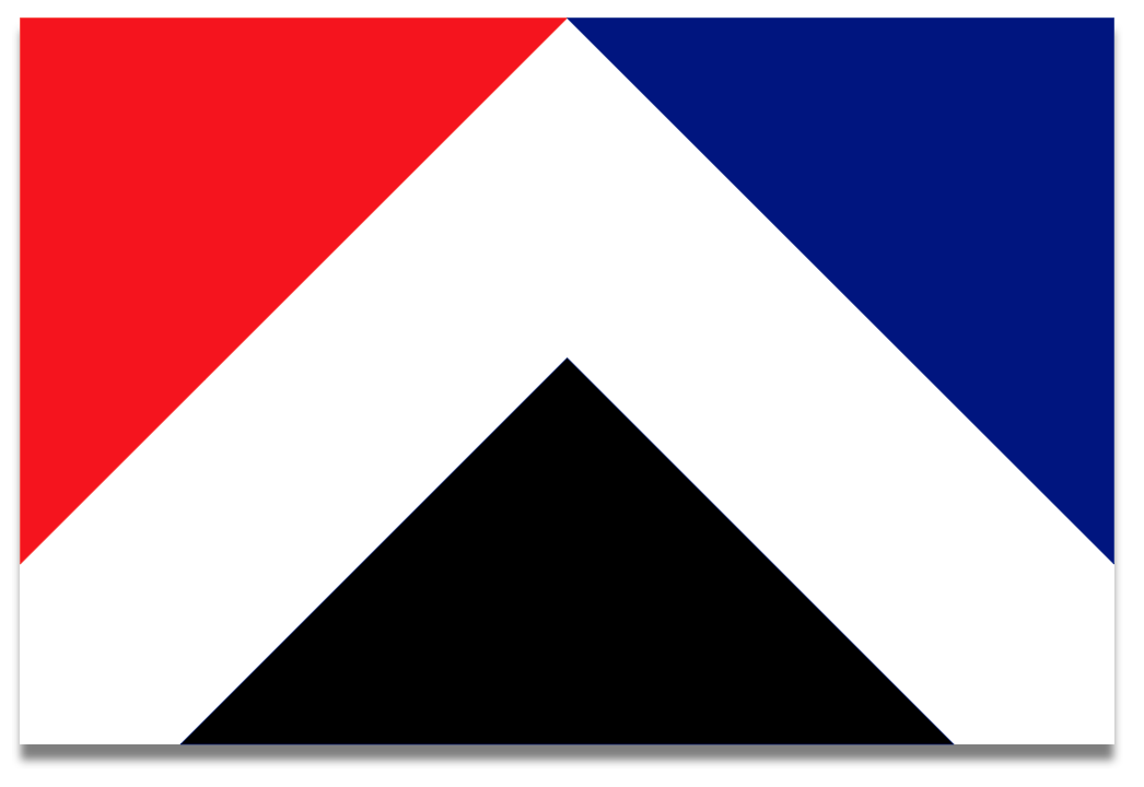
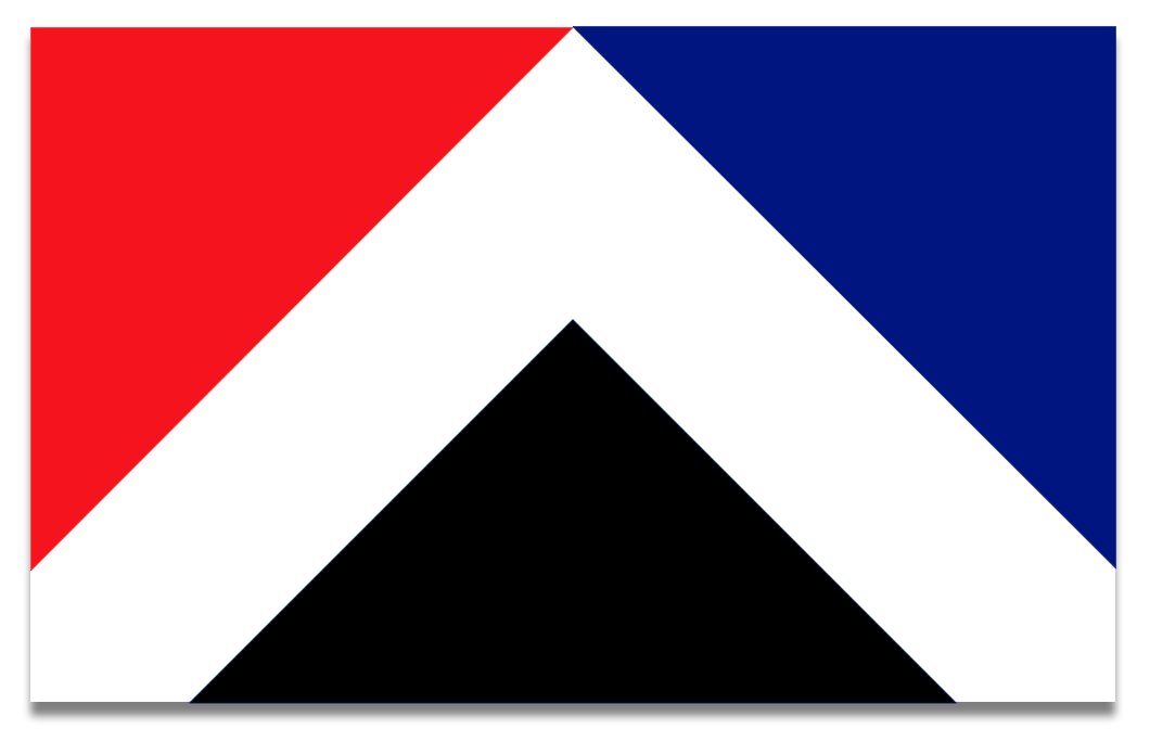
My favourite among these is Wā Kāinga, a very elegant but striking design consisting of three identically sized but differently coloured triangles arranged on a white field. (Here it is, animated.)
I love the concept behind this flag. The official blurb says:
The white diagonal shape is representative of the Maihi (Māori meeting house). Symbolic of the coming together of all three influences Maori, Colonial past, multicultural future. The red triangle represents our Māori heritage. The use of red, black and white references Tino Rangatiratanga. The blue triangle represents our British heritage, bordering a white diagonal line symbolising the Union Jack. The black triangle is offering up strength and optimism in a national context as well as being symbolic of our mountainous landscape.
It’s also an extremely easy flag to draw and looks good at big and small sizes. However, I’m not 100% convinced about those shades of red and blue - I think they’re both a little too bright. When I played around with this I used the blue colour from current NZ flag, and as close as I could get to the red colour in the Tino Rangatiratanga flag. Both of these colours could be lightened up a bit without being as bright as the designed version.
The other interesting thing is that the Māori colours are on the left, which to me is a subtle nod to who was here first. Nice!
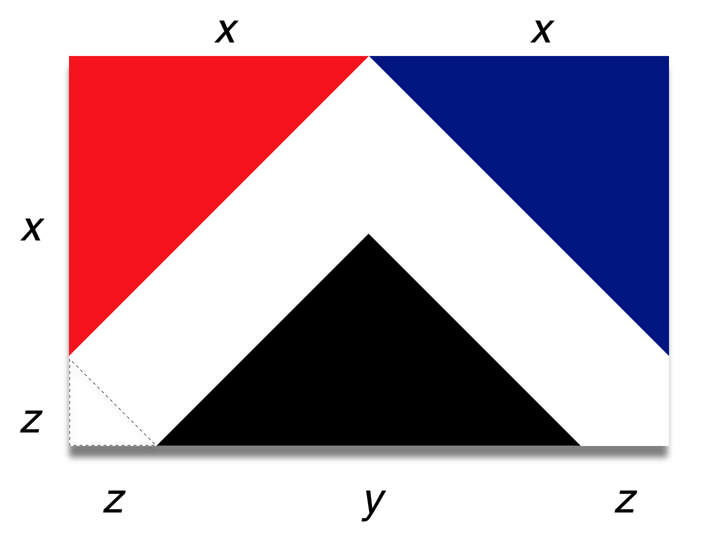
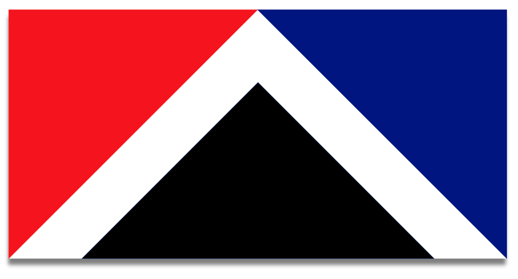
I find the shape of this flag intriguing. While the designers have put it into a handy, easy to use 2:3 proportioned rectangle, there is another, slightly narrower proportion for this flag that would likely be more preferable to obsessives everywhere.
The obsessive geometry bit
So, with our optimum flag variant I assume that each of the three triangles is right-angled with two equal-length sides extending from that right angle (i.e., an isosceles triangle). Then, I imagine that the white stripe also has (invisible) isosceles triangles placed at each end. Result: MOAR SYMMETRY! My eyes are immediately soothed.
You could diagram this like so:
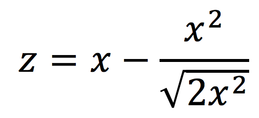
If you do that, and get a pencil and paper and break out your exceedingly rusty 4th form algebra, you can work out what z is. Having spent the better part of an entire evening on it I can tell you z is this:
And while I was scribbling on bits of paper, I also worked out what the proportions of our “optimum” flag would be, which is this:
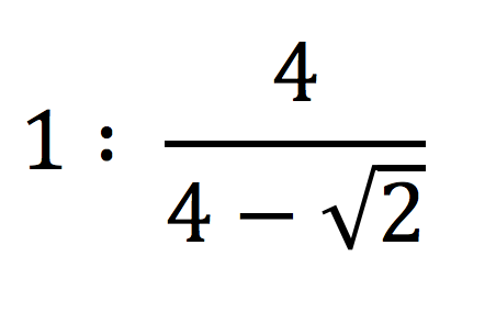
Or, expressed in decimals, a rather inconvenient—for-flag-manufacturers ratio of approximately 1:1.546918160678.
But. MOAR SYMMETRY!
But to continue…
Fun though this has been to work out I suspect the designers purposely went for the 2:3 proportioned variant to make it easier to draw and manufacture. 2:3 is not an unusual flag proportion (87 countries’ flags are 2:3), whereas only a couple other countries have flag proportions that are irrational.
But I think people may also prefer a longer flag more in keeping with our current flag’s 1:2 proportions. I tried a few other variants to see how this would look, while keeping the basic structure of three identical triangles intact.
5:8, which 5 countries use, is super easy to make up in a vector drawing program. Not only am I missing those nicely symmetrical ends to the white stripe already, but it seems to me like the white stripe is almost little too thin:
This is probably as about as wide as the design will go.
And, at 1:2 (the second most common flag proportion) the white stripe is obviously too narrow:
Horrible. To fix it, the black triangle would need to be made smaller, thus breaking one of the nice design features of the flag. So, yeah, nah.
Well, this is probably all a bit academic. No doubt, unless there’s a sustained campaign for this flag, we’ll end up with one of the Kyle Lockwood fern and stars variants (which I hope are not actually copyrighted by him - how would that work for a national flag?).
It could be worse. But it could be so much better.